Archive | Art RSS feed for this section

Hash’s Faves” Frank Kelly Freas

25 Jan

This week’s General Fave is the science-fiction artist Frank Kelly Freas, more commonlyFreas 1
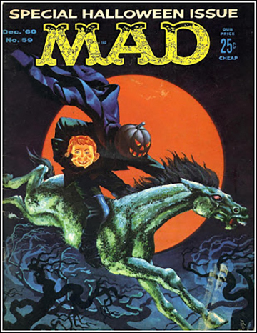
known as Kelly Freas. He was an incredibly prolific artist; I’m guessing his science-fiction work alone numbers well into the thousands, of book and magazine covers as well as interior illustrations. He also painted the official insignia for Skylab I, more than 500 portraits of saints for the Franciscans, and numerous cover paintings for Mad Magazine (although Norman Mingo was the more-or-less official artist for Alfred E. Neuman’s likeness, Freas did quite a lot of Neuman covers, and they’re every bit as good as Mingo’s).

Although I’m guessing I saw many of those Mad covers, I didn’t really Freas_2
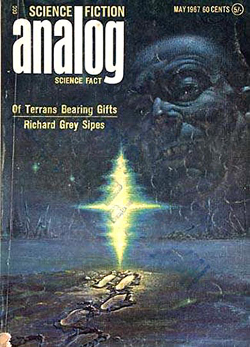
become aware of Freas’ work until I saw his cover for Analog Magazine in May of 1967. I had been a science-fiction reader (hardcore fans almost NEVER call it “sci-fi”) since I was very young; I think Madeleine L’Engle’s A Wrinkle In Time was my first, checked out from my grammar school’s reading room in 1962, followed by *Andre Norton’s Daybreak 2250 A.D.,* purchased from a mail-order book club. I wasn’t into the magazines so much, but some thing about Freas’ cover painting compelled me to buy this one; I have no memory whatsoever of the story that it illustrated.

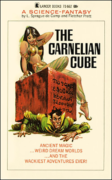
Born in 1922, he sold his first magazine cover painting to the venerable Weird Tales in 1950. Gnome Press published Freas_3
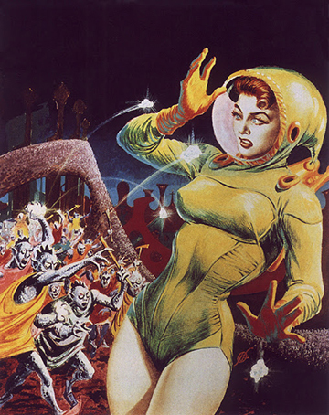
three book covers in 1952, and he started working for Astounding Science Fiction magazine in 1953; Astounding changed its name to Analog and Freas worked for them until 2003. He started working for Mad in 1957, and painted most of their covers until 1962, which would have been right around the time that I started reading the magazine. He also painted hundreds of covers for the paperback publishers Ace, DAW, Signet, Avon, Ballantine and Lancer.

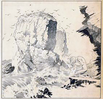
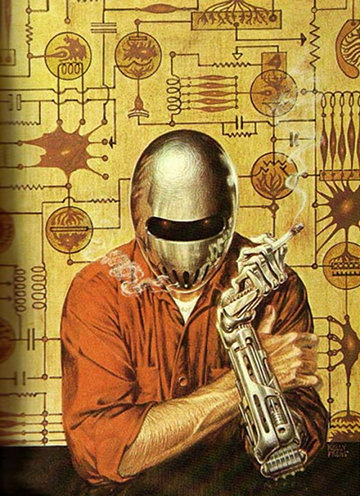
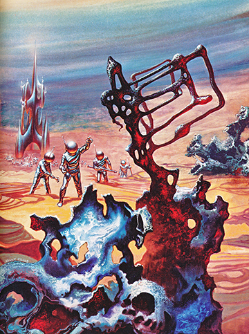
His style is instantly recognizable. His draftsmanship is clean, and his color palette really made some of his book covers (more so than the magazine covers) literally jump off the racks. His black-and-white work was always beautiful as well; he had a technique that I especially
Freas_4jpg
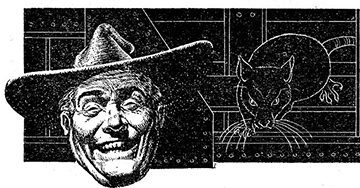
loved, pen and ink on a textured illustration board that used to be called either Ross board or coquille board; sports cartoonists used to use the technique a lot. After the
main illustration was done with the brush, he’s go over it and add shade values with a lithographic crayon. He also did a lot of scratchboard work, as well as straight-ahead pen and ink.

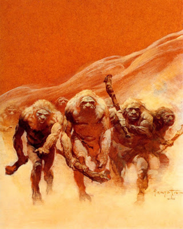
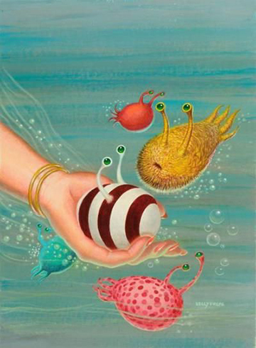
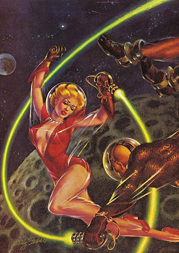
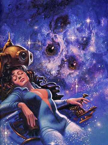
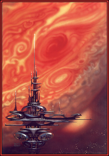
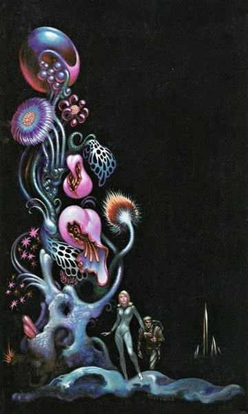
Like all artists, he had some visual tropes – the Kelly Freas spaceship, which owed a lot to the kind of streamlined spaceships drawn by Flash Gordon artist Mac Raboy; futuristic cities and space stations; robots; and of course, sexy (and usually scantily clad) women. Good lord, those Kelly Freas women! But like all artists, great and not-so, every once in a while he painted something that was completely uncharacteristic, like these cute lil’ creatures:

Freas_5

He was nominated for the annual Hugo Award for best science-fiction artist a remarkable 20 times, and won the award 11 times, an unbroken record. He died in 2005, and by all accounts he was a warm, humorous guy, a frequent guest of honor or simple attendee at many science-fiction conventions. He dominated the field in a way that I think no one before or since has.

Freas_6jpg


Freas_7


Freas_12


Freas_10


Freas_9


Freas_7


Freas_4


Freas_2


Freas_6


–Steve Hashimoto

This post is reprinted from News From The Trenches, a weekly newsletter of commentary from the viewpoint of a working musician published by Chicago bassist Steve Hashimoto. If you’d like to start receiving it, just let him know by emailing him at steven.hashimoto@sbcglobal.net

163984_190498084309709_7503578_n

Steve Hashimoto

Hash’s Faves: Frank Frazetta

27 Nov
Frazetta_Capp
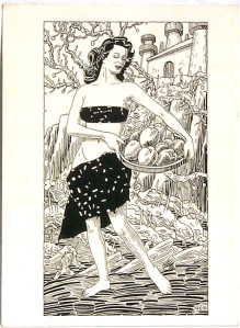
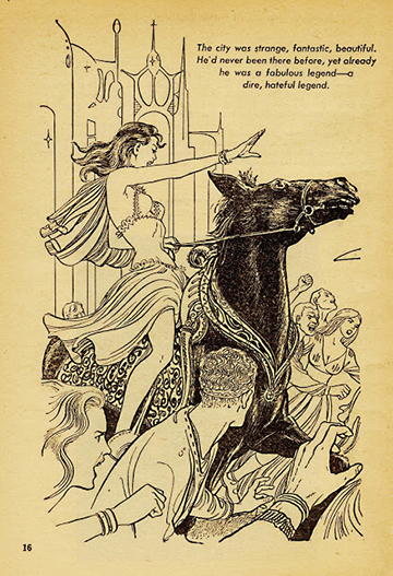
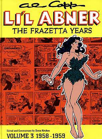
This week’s General Fave is the artist Frank Frazetta. I was going to describe him as “the fantasy artist,” but that’s only what he was best-known for; he also worked in the comics field, advertising, commercial illustration, and science fiction. He was part of the legendary EC Comics stable, and of what was known as the Fleagles, a loose-knit crew of young artists who evolved out of the EC stable to work on Mad Magazine. He drew what’s known in the comics world as ”funny animal” stories, as well as westerns, romance and science-fiction (one of his covers for the Buck Rogers comic book is iconic, much as I hate to use that word, but it applies); he was Al Capp’s assistant for 9 years, drawing mostly the sexy women in the Lil’ Abner comic strip. He also occasionally assisted on the Playboy comic feature Little Annie Fanny, mostly drawing Annie (Frazetta’s women were scandalously sexy; he always claimed that his wife Ellie was his principal model).
whats-new-pussycat-2
He did a lot of work for Hollywood; although many of you probably aren’t aware of
this, if you’re of a certain age you’ve seen his work. He did the artwork for the posters, one-sheets and ad campaigns for movies like What’s New, Pussycat?, The Night They Raided Minsky’s, After The Fox, Fitzwilly, The Busy Body and many others.
Tarzan_Lost_Empire
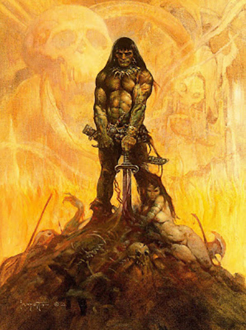
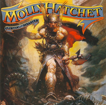
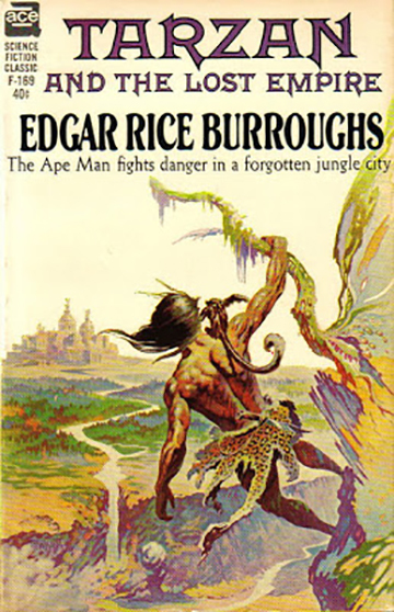
The work that catapulted him to pop-culture fame and recognition was probably the paperback cover work he did in the 60’s and 70’s, for Ace books’ Edgar Rice Burroughs editions (Tarzan, John Carter, etc.) and the Lancer books Conan series.
conan5

In the opinion of many, myself included, the Conan covers were his best work, especially the very first one in the series, Conan The Adventurer.

Frazetta_Neanderthal
He also did some very good work for Warren Magazines’ _Creepy, Eerie and Vampirella._
By all accounts he was a real mensch. He dominated the field for at least two decades. His philosophy and style fell out of favor in the 90’s and early ‘aughts, a period in which, in my humble opinion, typography went to hell in a handbasket. But I’ve tried to carry the torch in my own humble way…
Molly_Hatchet

The recognition he got for this work resulted in some high-visibility advertising and album cover work in the 80’s and 90’s, but he had some health problems as a result of long-term poisoning by the fumes from the kind of turpentine he used in his studio, and unfortunately some of his work during the 90’s especially had lost the indefinable magic that his mid-period paintings had. He also suffered a stroke that left his right arm almost completely paralyzed; he taught himself to paint with his left hand, but I don’t know how that worked out, since I don’t believe I’ve seen any of his work from this period. The last years of his life were fairly tragic. Along with his health problems (he had always been a rugged, active athlete, once having actually been scouted by the New York Giants), his lifelong companion Ellie died in 2009. Later that year his son, Frank Jr., was arrested for attempting to steal 90 of Frazetta’s paintings from the Frazetta Museum in Pennsylvania (charges were eventually dropped). And finally, on May 10,2010, Frazetta died.

City_In_The_Sea

Frazetta was the Charlie Parker/Coltrane/Bill Evans/Jaco of the fantasy art field; after his Conan covers appeared, his influence could be seen everywhere. Some of the young artists whose work closely resembled Frazetta, like Jeff Jones and Berni Wrightson, were eventually able to break free and find their own styles, while others like Boris Vallejo and Mike Hoffman became almost exact clones (not the worst thing to be, I guess). I must admit that when I thought I’d like to be a comics artist, the two stories that I actually had published (in a fanzine that I was the art director of; yeah, nepotism at its finest) bear Frazetta’s stamp to an embarrassing degree (I even styled my signature from those days after his). Thankfully, the only copies of those magazines that now exist are buried here in Hashimotoville, never to be seen by prying eyes.

Frank’s work isn’t perfect; it pains me to say that, but it’s true. Sometimes his anatomy gets a little wonky; I don’t think he ever formally studied anatomy, as in dissecting cadavers (just as he used Ellie as his primary female model, Ellie said that he used himself as his male model). His mentor, Roy G. Krenkel, did, I think; Roy’s figures always look alive and fluid, whereas sometimes Frank’s can be stiff, and sometimes if you really look carefully, limbs can look out of place, and there are funny lumps. But that’s only occasionally (Wally Wood, another of my favorite artists, also sometimes had weird anatomy). Frank was a child prodigy, the story being that he attended the Brooklyn Academy of Arts at age 8, which was run by an instructor named Michael Falanga. I think Falanga was so bowled over by the kid’s precocity that he let Frank get away with murder, and even Frazetta admits that he didn’t learn much there.

As with a lot of people with incredible natural talent, I think Frank sometimes coasted. But Frank’s coasting was usually better than anybody else’s flat-out running. At his best, his figures burst with life and have a tangible weight, but the thing that I think I love the most in his best work is the sense of mystery. He doesn’t feel compelled to paint every detail, often merely suggesting stuff going on in the background. The work of his that I find the least interesting, from his “turpentine” period, seems over-painted and over-rendered. But that’s just nit-picking and sour grapes; if I could draw and paint like him, I’d be one happy (and wealthier) camper.

This post is reprinted from News From The Trenches, a weekly newsletter of commentary from the viewpoint of a working musician published by Chicago bassist Steve Hashimoto. If you’d like to start receiving it, just let him know by emailing him at steven.hashimoto@sbcglobal.net.


163984_190498084309709_7503578_n

Steve Hashimoto


CD Graphics & Jamming

18 Apr

Chicago bassist, Steve Hashimoto, recently wrote about his experiences doing CD graphic design, and compared them his work as a bass man. I’m reprinting what he said, below, and including samples of his graphics work.

163984_190498084309709_7503578_n

Steve Hashimoto

As some of you know, I’m a graphic designer as well as a musician. I don’t think I have an identifiable style in graphic design; whether that’s good or bad I can’t say. Some of my favorite designers do have a style that I can identify immediately: Herb Lubalin, Reid Miles, Seymour Chwast, Michael Dorét, Milton Glaser, Gerard Huerta, The Hipgnosis Studio, all produced distinctive work. On the other hand, quite a lot of my favorite designers, like Paul Rand, George Lois and Lou Dorfsman were more chameleonic, producing work to fulfill a variety of purposes. And that’s what I think I do.

If you check out the samples below, and you’ll see that my clients have included jazz musicians, rock bands, country singers, new-age artists, easy-listening singers, singer/songwriters, and some not-easily-classifiable people. When I design a package I try to take everything into account, but oftentimes I’ll have no idea what the music is like; sometimes the clients don’t want a stranger to hear anything until it’s actually released, fearing internet leaks, and sometimes there’s just no time. I usually know the artist and most, if not all, of the sidemen, but sometimes not. But what I really go on is gut instinct; what the CD’s title is, what the artist or manager can tell me about the music, and what the genre is. I really liken what I do to how I operate as a musician; when I’m recording, I always hope that the first take will be the best, if not technically then at least conceptually, and that we can fine tune it along the way. Both in my music and in my visual art I tend to find that an idea can be worked to death, and I hope that my clients will like whatever my first idea is.

Again, equating my music and my design work, I have constraints to work within. Budget and time, obviously, but, just as when I’m playing a song and have to conform to general rules of harmony and theory, the structure of the song, the chord changes, tempo, etc., in a graphics job I have to know the lay of the land. Every CD manufacturing company has a proprietary set of templates to work with, and that’s actually how I get a lot of work. A lot of musicians are very gifted visual artists as well, painters or photographers, and feel like they can do their own project, but once they get into the template they find that it’s much more daunting a task then they initially thought. There are esoteric things to know like what color space to work in, what format or program the manufacturer wants to see the final artwork delivered in, bleeds and trims and folds. I’m happy to act like a carpenter, working from the artist’s blueprints; quite a few of my favorite jobs have been that type. But I also love it when a client says “Do whatever you want.”

I run into problems, of course; a lot of clients simply have no spatial perception. They have

240372_10150180579861379_410835_o

4-page insert

a budget for a 4-page insert (one piece of paper folded in half) and they have 12 pages of Microsoft Word copy that they want crammed into it. Or they have a piece of art that a friend or spouse did and the dimensions just don’t want to fit. They have a portrait photograph and there’s not enough background; they don’t understand that for artwork to “bleed”, or print to the edge of the paper, that it actually has to extend past the edge of the paper and that the excess will be physically trimmed off (because of this kind of problem, which is probably the one I encounter the most, I’ve had to learn a lot of Photoshop tricks). They’re married to a particular font that is horrible. In cases like these I put my jobbing hat on and I just do what I can to either make things work, explain why it’s impossible or present an alternative that’s so brilliant that they immediately see the light. And, of course, sometimes the answer is “No, do what I want,” and I do what I can, and wind up with a job that I’ll never use in my portfolio.

231092_10150180573356379_3921274_n

front & back

Another way that I think my music and my design are similar is that, when I solo on a jazz tune, I hope that it won’t be predictable. Of course all of us have little licks that we tend to play, and you can’t be brilliantly original every night, sometimes you’re just vamping. But I try, in both of my disciplines, to be creative, and I always hope that lightning will strike; that I’ll be playing ”It Had To Be You” for the 2,000th time and the singer lets me play a solo and the Gods of Jazz whisper in my ear and I play a solo unlike any I’ve ever played. I hope that when a client contacts me to design their project that the heavens will open for a second and the entire design gets beamed to my brain. It could happen, right?

Anyway, I dearly love the work; every project is fun, and when I finish one I can’t wait to see what it looks like when it comes off the presses. You could do worse than hiring me if you’re thinking of making a CD. I have one other special skill that many people overlook or minimize, but I think it’s important. I once had a client submit a project and he had misspelled not only most of the musicians’ names (I knew every single one of them) but other important items like song titles and names of musical styles (I fixed everything, of course). Many designers wouldn’t know the difference and/or wouldn’t care – “It’s not my yob, man!” But I care. So give me a call.


This post is reprinted from Steve’s free weekly e-newsletter, News From The Trenches. If you’d like to get on its on its mailing list, just contact him at  steven.hashimoto@sbcglobal.net. You can also reach him there if you’re interested in having him do graphics for your CD. More examples of his graphics work appear below:


1234361_10151662577216379_645224989_n

220374_10150180736071379_4357887_o


221342_10150180551221379_3496151_o

224237_10150181431291379_8314590_n

228707_10150180584706379_6138988_n

229344_10150180567366379_6152947_n

231092_10150180573356379_3921274_n

240372_10150180579861379_410835_o

240593_10150180735431379_4166712_o

226852_10150181436481379_1497471_n

482600_10151339578856379_1133058756_n

522428_10151155399686379_1846464321_n

10170966_10152089838096379_4011658322943929247_n

219510_10150180556426379_3312273_o

227073_10150180569366379_6015288_n


Live Music VS Sand Painting

15 Nov

sand paintingLive music rivals sand-painting as impermanence’s perfect symbol. I believe that. A band works up songs for weeks and then goes out and plays. When the show’s over, what’s left? Or when a sand painting blows away?

A while ago we got a Zoom video recorder. Around a cell-phones’s size, it sports a couple condenser mikes. We started recording our shows and hoping they’ll be around forever. We’re stashing them in a time capsule. A lot of them here are on this blog, too: Just click the “Making Music” category.

The McDaniels @ Heartland Cafe

The McDaniels @ Heartland Cafe

When we play we forget the camera. But what if some corner of our mind still sees it– maybe in peripheral vision?

What if?

So we’re not recording our next show. At Independence Tap, 3932 W. Irving Park, Chicago. This coming Friday, November 20 at 8:00 PM. Let’s see how that feels.

Like we’re sand painting.

The McDaniels behind the Backlot Bash.

The McDaniels behind the Backlot Bash.

Artist Robert E. Gilbert (REG)

13 Jul


Alien landscape by REG

Robert E. Gilbert, who signed his work REG, was arguably the most prolific and popular illustrator of SF fanzines in the 1960s. His covers and interior illos were nearly ubiquitous, particularly in midwestern and southern zines. They appeared everywhere from popular regional zines like IscariotMaelstrom, and Double Bill to Hugo-nominated zines like Yandro and Amra. And he regularly won “Best Fan Artist” in the egoboo polls of the Southern Fandom Press Alliance.

With their generally bold simple lines, his drawings were perfect for the

An REG fanzine illo from the Sixties.

zines of the day, most of which were mimeographed. The mimeograph has gone the way of the VCR, but it was the way most zines were done in the 1960s, and art had to be traced laboriously onto a mimeograph stencil with a metal stylus. So the relative simplicity of REG’s drawings was a plus, but his work was hardly crude; it was well-designed and frequently hinted at some story.

A few years ago I rejoined the Southern Fandom Press Alliance (SFPA), after having been away a mere four decades, and as SFPA’s 50th anniversary approached, some discussion arose about how to commemorate it. I suggested to the group’s official archivist, Ned Brooks, that a portfolio of REG

cover from, Amra, a Sixties Sword & Sorcery fanzine

covers would be an excellent thing to include in the 50th anniversary mailing of SFPA. He demurred–perhaps shrinking from the prospect of rummaging through his 12,000 fanzine archive for REG covers. He did, however, dig up two REG covers and printed them in his zine, The Newport News, using one for the cover of issue.

Having thought of Robert E. Gilbert for the first time in years, I Googled him. I didn’t find a lot, but I did get two surprises. One was that REG had made three professional sales of SF stories. (These can be found at: http://www.gutenberg.org/ebooks/author/34313) Another was that a gallery had purchased over 400 of his drawings and paintings. Paintings? I never knew REG painted. I found all that interesting but soon forgot about it.

November, 1952 issue of Galaxy, in which REG's story, "A Thought for Tomorrow," appeared.

That’s because, unlike my old friend, Bill Plott, I’m not a seasoned professional journalist. Back when he was in his teens and early twenties, Bill Plott edited a couple of now legendary zines, Maelstrom and Sporadic, before he left SF fandom behind for a distinguished career as a journalist. Much like myself, he was recently drawn back into publishing through SFPA, after four decades away, and resurrected his zine, Sporadic. As he relates in the latest issue (#18) of that zine, this eventually prompted him to delve into his boxes of old fannish material, where he discovered a trove of some 20 unpublished REG illos.

Once he stopped doing backflips around the neighborhood, he got curious: Maybe Robert E. Gilbert was still around. So he Googled him, as I had done, and found the site with all of REG’s paintings at http://www.folkartisans.com. Unlike me, though, he didn’t think, “Oh, that’s interesting,” and shrug it off; he eventually contacted Folk Artisans, a gallery in Mentone, Alabama. First, he went to their website, where he saw that REG, a Tennessean, had died in 1993. Bill sent that information to his friend, genealogist and fellow SFPA member, Larry Montgomery. Larry got back to him with the information that REG was born May 26, 1924 in Sullivan County, Tennessee and died April 4, 1993, seemingly in Jonesborough, Tennessee. Further REG had served in the US ARmy from January 31, 1943 to August 9, 1944.

That was pretty much all they had, until Bill reached one of the gallery owners, Matt Lippa, by phone. In Sporadic 18, Bill writes:


Another strange landscape by REG, 1964

He [Matt Lippa] said that they bought the paintings sight-unseen via auction.

“It was very last minute. We got a call from a friend who was going to the auction. We literally had our topcoats and hats on and were heading out the door for a trip when the phone rang. I answered and was told about the art. It was not catalogued, put on at the end and never advertised. I told my friend to bid up to a certain amount–sight unseen. Got a call from him the next night that we got the bid and he would bring it to us.

“We did finally speak with the auctioneer who could give us NO info, and said he tried to get it. He said the family was very uncooperative with information about Gilbert. He was something of an outcast, apparently, and they wanted nothing to do with him. Our Friend took one of them to dinner and a bar and was not able to break through that,” Matt related.

The gallery acquired the collection in 2003.

Later in Sporadic 18, Bill writes:

I have speculated a lot on the estrangement from his [Gilbert’s} estrangement from his family. Living in that mountainous region, I wondered if his family was very fundamentalist and found pictures of scantily clad women sinful. I wonder if it was science fiction, being something just too weird for them to relate to. Or some behavioral situation totally unrelated to his art. We will likely never know.

Like Bill, I’m curious about REG’s black sheep status. I’m also intrigued by the picture of REG that emerges. Estranged from his family, living in a small town in the rural South, creating hundreds of illos for fanzines, writing the occasional SF short story, and painting hundreds of unearthly paintings, few of which, it would seem, ever sold. It’s an archetypical image of the lonely artist, toiling in obscurity.10reg_big

What parts of the picture are we missing though? Does anyone have any more information on Robert E. Gilbert?

To view more of REG’s artwork, go tohttp://www.folkartisans.com.

Robert E. Gilbert in Black and White

6 Jul

kentmcdanielwrites

By Robert E. Gilbert By Robert E. Gilbert

In the 1960s and early 1970s Robert E. Gilbert (or REG as he was known) was a prolific fan artist in science fiction fandom–and a popular one. More than once the members of the Southern Fandom Press Alliance voted him Best Fan Artist, and his work appeared on the covers and inside of Hugo Award winning fanzines such as Yandro and Amra, along with scores of other popular SF fanzines.

Details on his personal life are scant, but ten years after his death in 1993, a trove of some four hundred paintings and black and white drawings by REG surfaced. A folk art gallery in Alabama, Folk Artisans, eventually purchased the works at an auction. Although some of the works have sold, pictures of many of the paintings and drawings are still up at the gallery’s website (www.folkartisans.com).

I wrote about REG’s paintings, many of which…

View original post 476 more words

John W. Campbell art director?

6 Jul

kentmcdanielwrites

         I READ SOMETHING SURPRISINGin issue #32 of Illustration, a magazine about which I’ve long been curious but had never before picked up—probably due to its $15.00 an issue price tag. Anyhow for some reason, I finally broke down a sprang for a copy, and inside there was a short piece about Robert Adranga, who apparently did a lot of well-received covers for a Hitchcock YA mysteries series called The Three Investigators. I remembered Adranga’s name because he did a cover for Fantastic back in the sixties that I loved (I still have the issue, and the cover was also reproduced in the article.) It turns out that the Fantastic cover was Adranga’s first sale, made while he was yet in art school. The interviewer asked him about it, and it was Adranga’s answer which surprised me. Here’s what he said:

            “I took my portfolio to those two…

View original post 315 more words

Preliminary Cover Sketches for JIMMY STU LIVES!

6 Jul

kentmcdanielwrites

My novel Jimmy Stu Lives!, a satire set in the framework of a science-fiction adventure, should be coming out sometime next month from Penumbra Publishing (www.penumbrapublishing.com) . Joe Staton, an artist whose work I very much admire, is doing the cover for it. Joe and I were both in Southern Fandom Press Alliance (SFPA ) back in the Sixties (when we were both toddlers), and he actually did the cover for an issue of my fanzine in those days, Outre’.  I no longer have that issue—you know how it goes—but through the miracle of modern technology, I was able to get my hands on a copy of the cover. Ned Brooks, venerable Official Archivist of Southern Fandom Press Alliance, located the issue, Outre’ #3, scanned the cover and emailed it to me, informing me that the issue had appeared in SFPA mailing #14 (circa 1963).  

         So this will actually be…

View original post 347 more words