Chicago bassist, Steve Hashimoto, recently wrote about his experiences doing CD graphic design, and compared them his work as a bass man. I’m reprinting what he said, below, and including samples of his graphics work.

Steve Hashimoto
As some of you know, I’m a graphic designer as well as a musician. I don’t think I have an identifiable style in graphic design; whether that’s good or bad I can’t say. Some of my favorite designers do have a style that I can identify immediately: Herb Lubalin, Reid Miles, Seymour Chwast, Michael Dorét, Milton Glaser, Gerard Huerta, The Hipgnosis Studio, all produced distinctive work. On the other hand, quite a lot of my favorite designers, like Paul Rand, George Lois and Lou Dorfsman were more chameleonic, producing work to fulfill a variety of purposes. And that’s what I think I do.
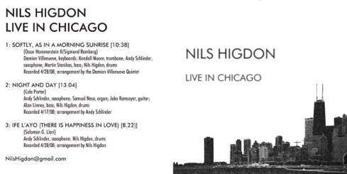
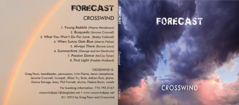
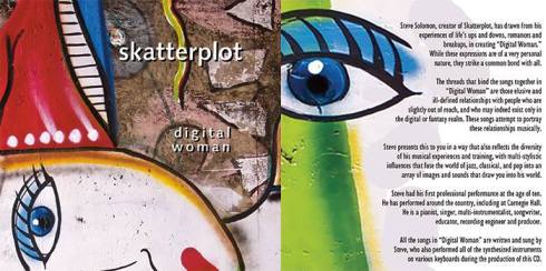
If you check out the samples below, and you’ll see that my clients have included jazz musicians, rock bands, country singers, new-age artists, easy-listening singers, singer/songwriters, and some not-easily-classifiable people. When I design a package I try to take everything into account, but oftentimes I’ll have no idea what the music is like; sometimes the clients don’t want a stranger to hear anything until it’s actually released, fearing internet leaks, and sometimes there’s just no time. I usually know the artist and most, if not all, of the sidemen, but sometimes not. But what I really go on is gut instinct; what the CD’s title is, what the artist or manager can tell me about the music, and what the genre is. I really liken what I do to how I operate as a musician; when I’m recording, I always hope that the first take will be the best, if not technically then at least conceptually, and that we can fine tune it along the way. Both in my music and in my visual art I tend to find that an idea can be worked to death, and I hope that my clients will like whatever my first idea is.
Again, equating my music and my design work, I have constraints to work within. Budget and time, obviously, but, just as when I’m playing a song and have to conform to general rules of harmony and theory, the structure of the song, the chord changes, tempo, etc., in a graphics job I have to know the lay of the land. Every CD manufacturing company has a proprietary set of templates to work with, and that’s actually how I get a lot of work. A lot of musicians are very gifted visual artists as well, painters or photographers, and feel like they can do their own project, but once they get into the template they find that it’s much more daunting a task then they initially thought. There are esoteric things to know like what color space to work in, what format or program the manufacturer wants to see the final artwork delivered in, bleeds and trims and folds. I’m happy to act like a carpenter, working from the artist’s blueprints; quite a few of my favorite jobs have been that type. But I also love it when a client says “Do whatever you want.”
I run into problems, of course; a lot of clients simply have no spatial perception. They have

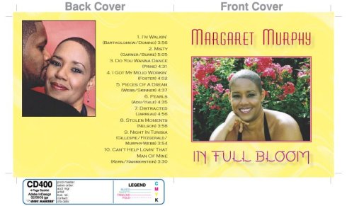
4-page insert
a budget for a 4-page insert (one piece of paper folded in half) and they have 12 pages of Microsoft Word copy that they want crammed into it. Or they have a piece of art that a friend or spouse did and the dimensions just don’t want to fit. They have a portrait photograph and there’s not enough background; they don’t understand that for artwork to “bleed”, or print to the edge of the paper, that it actually has to extend past the edge of the paper and that the excess will be physically trimmed off (because of this kind of problem, which is probably the one I encounter the most, I’ve had to learn a lot of Photoshop tricks). They’re married to a particular font that is horrible. In cases like these I put my jobbing hat on and I just do what I can to either make things work, explain why it’s impossible or present an alternative that’s so brilliant that they immediately see the light. And, of course, sometimes the answer is “No, do what I want,” and I do what I can, and wind up with a job that I’ll never use in my portfolio.

front & back
Another way that I think my music and my design are similar is that, when I solo on a jazz tune, I hope that it won’t be predictable. Of course all of us have little licks that we tend to play, and you can’t be brilliantly original every night, sometimes you’re just vamping. But I try, in both of my disciplines, to be creative, and I always hope that lightning will strike; that I’ll be playing ”It Had To Be You” for the 2,000th time and the singer lets me play a solo and the Gods of Jazz whisper in my ear and I play a solo unlike any I’ve ever played. I hope that when a client contacts me to design their project that the heavens will open for a second and the entire design gets beamed to my brain. It could happen, right?
Anyway, I dearly love the work; every project is fun, and when I finish one I can’t wait to see what it looks like when it comes off the presses. You could do worse than hiring me if you’re thinking of making a CD. I have one other special skill that many people overlook or minimize, but I think it’s important. I once had a client submit a project and he had misspelled not only most of the musicians’ names (I knew every single one of them) but other important items like song titles and names of musical styles (I fixed everything, of course). Many designers wouldn’t know the difference and/or wouldn’t care – “It’s not my yob, man!” But I care. So give me a call.
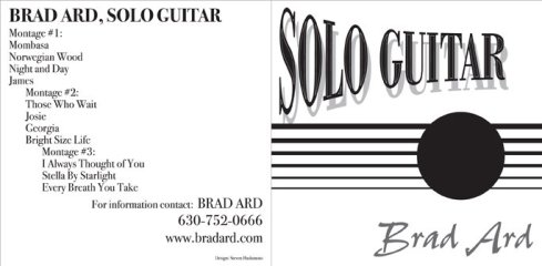
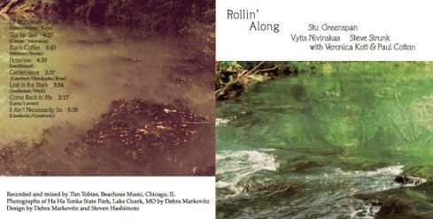
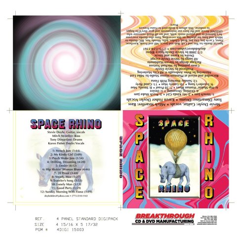
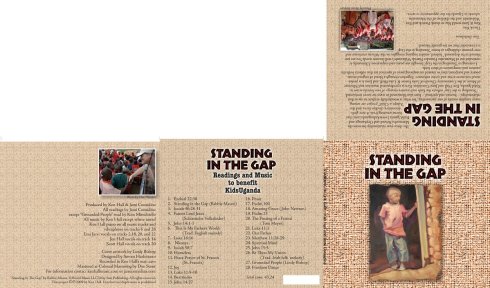
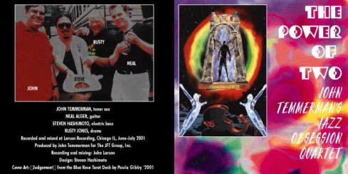
This post is reprinted from Steve’s free weekly e-newsletter, News From The Trenches. If you’d like to get on its on its mailing list, just contact him at steven.hashimoto@sbcglobal.net. You can also reach him there if you’re interested in having him do graphics for your CD. More examples of his graphics work appear below: